Dateline: 2.10.1
Are the Jalopnik C7 renderings revving you up, or stalling you out?
Be sure to take out C7 Jalopnik rendering poll at the bottom of this post!
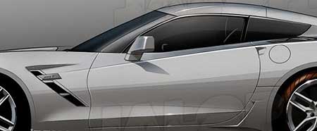
I’ve been meaning to get to this for about two months now. Back on November 14, 2011, Jalopnik.com dropped a fire bomb on the Corvette community with three renderings of what they claim to be, accurate illustrations of a ZR1 version of the C7 Corvette. Chevrolet immediately said, “Thanks, but WRONG, Jalopnik!” And Jalopnik called GM’s response, “a weak ass denial…” Okay, play NICE, everyone!
So, it’s been almost three months and if you read through the various forums and blog comments, not everyone is jazzed about what they see. Initially, Jalopnik said they would be releasing “photos” and then delivered “renderings,” claiming that their inside source swears on his mother’s grave that the created renderings are correct. I also have it from a Corvette writer friend with an inside source (I don’t know if it’s the same source as Jalopnik’s) that the renderings are spot on. Yes, right down to the Camaro taillights. My friend’s friend claims that even though Chevrolet knows that the Corvette fans will negatively react to the Camaro taillights, it’s a “corporate look” that runs across the Chevrolet line. I suppose it’s like how the Chevy Volt’s front end almost looks like a Malibu.
Since the Jalopnik renderings were published, there have been a rash of C7 sightings wearing those totally UGLY camo suits that could make a Playboy centerfold girl look like a dawg!. About the only thing that clear is that the car will (might) have quad exhaust pipes and LED taillights. But most obvious is the overall shape. Sorry guys, but it sure does look like a C6. And it’s BIG too.
All the chatter aside, the good news is that we now know that if all goes well, the C7 2014 Corvette will make its grand debut at the 2013 Detroit Auto Show in January ‘13 and dealers will start taking orders for the C7 in Spring ‘13. So, in 11 months, all the panting and speculating will be over and we’ll have a new Corvette to love.
I’ve been a “car guy” and into Corvettes since 1965. I’ve created hundreds of Corvette illustrations, designed my own versions, and worked as a toy designer for Tyco Toys and Mattel Mt. Laurel. As a designer, when you are showing a new design, you want to get an immediate “WOW!” That “WOW!” has to come out in about a half of a second. It’s the expression of instant excitement. If your brain needs “think about it” and “look” for something to like, the design ain’t making it.
The day before the Jalopnik images were published, Jalopnik announced that they had a major announcement for the following day. So, I too was excited to see what the images looked like. I was NOT wowed. Sorry, but my immediate, gut response was, well, flat. I had to look around to find something to like. After a time, I remembered the first time I saw the current C6 Corvette. In ‘04 wasn’t this intense, internet-driven anticipation for the C6. I looked at the ‘05 Corvette and a second later said out loud, “NICE!” And the more I looked, the more I liked.
The Jalopnik renderings left me wondering, “Why isn’t this grabbing me?” I don’t want to have to “get used to it.” The new Corvete should set your soul on FIRE. So I sat with the images for a long time and just “looked” at them, and still couldn’t get warm. Not that my opinion matters a hill of beans, but when I start thinking, “Gee, I hope these illustrations aren’t right.” You know something is seriously off. So, we’ll just have to wait and see.
In the mean time, just to be “fair and balanced,” I made a list of everything I like (and why) and everything I don’t like (and why). So, here goes…
What I Like About the Jalopnik C7 Renderings
1. Sharp body creases – Hands-down, the best, most dynamic Corvette designer of all time, Bill Mitchell, once said that cars should look like a successful man wearing a pressed suit with sharp creases. Take note of the sharp lines of the C2 and C3 Corvette. It’s what made people say, “Man, that car is SHARP!”
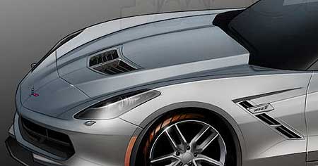
2. No fake nose scoop – The nose scoop on the Grand Sport/Z06/ZR1 is a cool looking design that would be cooler if it was a real scoop. I don’t miss the fake nose scoop.
3. The strong, central body crease – It’s a little hard to tell if what we’re looking at is a horizon reflection line that passes through the mid section, or an actual body crease, ala the C2 and C3 Corvette. If it’s a real crease, I like it.
4. The pinched in center section in the doors – I really like that the car’s flanks show a hip curve. Mitchell was very influenced by Italian designs of the ‘50s and early ‘60s with their voluptuous curves. Many of the italian cars of that era looked like automotive versions of Sophia Loren and Gina Lollobrigida. “O’La-La, Ba-BOOM!” Guys, I think you’ll agree with me, sexy cars and women definitely go together.
5. The headlight lens covers – I like how the strong fender curve runs into the lens.
6. The front grille opening and spoiler – It’s a little hard to tell from the rendering, but the grille opening looks appropriately Corvette-like and the spoiler-splitter looks organic to the body.
What I Don’t Like About the Jalopnik C7 Renderings
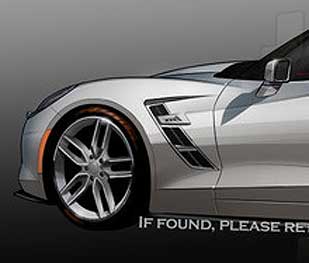
1. Gimmicky side markers – It looks like, “We’ll just put this here.” I’d expect this from a Mazda.
2. The crisscrossed front and rear fender lines – Haven’t we seen this on a Toyota car?
3. The rear fender vents – Sorry, but it just looks like a do-dad to me – an afterthought.
4. The roof line – I’ve seen this somewhere else, but can’t quite place it. But it looks like “something else.”
5. The hood dome is uninspiring – It’s just “there” and the vents are right off of the Camaro ZL-1. More “corporate look”? The hood dome of a top-level performance car should scream, “Something SPECIAL and POWERFUL is under here!” Since when does the Corvette FOLLOW the Camaro? Maybe beginning next year?
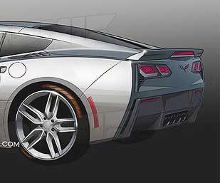
6. The rear fender scoop – Haven’t we seen this on Honda Civics outfitted with body kits?
7. Taillights – Right off the Camaro. BARF! If what we’re seeing is correct, Chevrolet is never going to hear the end of it.
8. Rear spoiler – A tacked on after thought. I suppose it fits with all the rest of the notchy design elements.
9. Rear bumper cover – All straight angled lines that don’t fit with the sweeping curves of the fenders. And the area under the taillights is very uninspiring.
10. Gas filler door – The round door doesn’t fit in with anything.
11. The A-pillars – Straight out of the C6 parts bin?
12. The ZR1 side badge – Parked sort’a in the middle of two vents, just looks odd. And connecting with the rear fender line sweep doesn’t help.
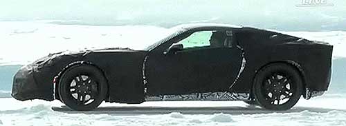
13. The car looks BIG – Okay, it’s just a rendering, but the car looks LONG and the back end looks thick. This is not a svelte design. Even the spy photos of the disguised C7 look big, especially when you look at the person inside the car. The wheelbase looks longer too. So if this C7 is indeed a bigger car, we’ll never hear the end of that too.
14. Side-view mirrors – More parts bin.
Well I think that’s enough damage for one critique. I’m certain that as we move through 2012 there’ll be more spy photo images as the Corvette team does more and more testing of preproduction Corvettes on public roads. Here are a few afterthoughts.
The days of a GM chief designer with a strong personality are long over. When Bill Mitchell retired in 1977, GM’s upper management said never again would they allow so much power in the hands of one executive. When Mitchell left, the era of the focus groups took over. The amount of money needed to design and develop a modern car is astonishing and management wants assurances that what they will be offering will be what people will buy. Focus group research and analysis makes upper management feel good. The problem is that when you approach design with the focus group model, you end up with a design that’s got a little of this and a little of that. “Design by committee” is the correct expression, with Marketing people saying, “Our surveys indicate that potential buyers like the lines of the ______.”
Frank Lloyd Wright, arguably the greatest American architect, never knocked on doors asking housewives, “So, what do you think a house should look like?” Focus group design is regressive because it’s always looking back. The Sting Ray and the Mako Shark are classic examples of forward thinking, original designs that looked ahead and not back. Yes, Mitchell had been influenced by other cars, but no one ever looked at the Sting Ray or Mako Shark II and said, “Gee, it looks kind’a like a ______.”
Many years ago, someone noted that designing a new Corvette is the hardest job in automotive design because the new shape has to look “new” but it has to look like a “Corvette.” In a sense, the Corvette lives in its own world. But if a design drifts away from it’s roots, you end up with the Camaros and Mustangs of the early ‘90s that look NOTHING like their roots. It’s not the badge that makes the mystique, it’s the shape. That’s why the new Mustang has been such a success, because it “looks” like a Mustang! Same with the Dodge Challenger and to a lesser degree, the Camaro. (the Camaro is about 20% too big and looks like a Hot Wheels car-toon)
Even though the Corvette lives in its own world, it has a very rich history pool of classic designs to draw from. I wasn’t expecting a retro-Corvette, ala the new, retro ‘69 Camaro. But even now, almost three months after first seeing the Jalopnik renderings, I’m still not used to what I’m seeing and am waiting to get warm. – Scott
Related:
Check out all of our C7 posts by using the “Generations” tap at the top of the page.
Read the complete Jalopnik story HERE.
Check out the video from InsideLine of a disguised C7 in the snow, HERE.
Here’s the BEST way to keep up with K. Scott Teeters’ Corvette blog!


I agree with just about everything KST said.
I noticed that the roof of the Spy pic Mule car has a recess running the length of the car (not sure what this is called) similar to the current C6 but in the pics it seems much “wider” than the C6 recess, unless it an optical illusion.
If this is the real C7 body in the spy shots, and Jalopnic really did see a finished C7 and rendered it as posted, why did Jalopnic “miss” this very obvious detail?
p
Good question. It’s so hard to tell with spy photos of disguised mule cars. If you have old magazines from ’95 and ’04, you can probably find spy shots of the C5 and C6 mules. One thing is consistent, those mules are always butt-ugly. Thanks for taking the time to comment! – Scott
I seem to recall that initially Jalopnic said that they had PHOTOS that they would be publishing. Then they showed renderings and explained that their “insider” that saw the real C7 sat down with their computer illustrator and guided the rendering process. Of course, GM told Jalopnik, “Thanks for the interest, but WRONG!” To which Jalopnik clained that GM issued a “weak ass” denial. Play nice, boys!
We all want the next Vette to be a heart stopper, but the problem isn’t a new one. Every new Corvette has to look “new” but if has to look like a Vette. There seems to be two camps here. One looks at the car’s history and feels that with all of the car’s rich design heritage, the new Vette should always look “like a Corvette” in the same way that a 911 Porsche still looks like a 911 Porsche – only seriously updated. Then the other camps says, “it’s time for a clean sheet of paper. The next Vette should look completely new.” And that’s how once great, classic designs can get lost. By 2001 the Camaro was so lost the market bought other cars and GM killed the Camaro. And the Mustang as equally as lost. Ford did an EXCELLENT retro Mustang and scored big time, then Chevy had to play catch up.
But shapes aside, one thing that I noticed that I haven’t heard much chatter about is this. One of the spy photos of the C7 in the Michigan snow showed a side view profile with a man in the driver’s seat. This was either a little dude or the car is very big. I guess we’ll have to wait and see, huh? – Scott
Maybe you are referring to the “double-bubble” roof design? Jalopnik initially said they had “photos” then showed “illustrations” created by a computer artist, at the direction of the person that claims they saw a ‘15 ZR1. After years and years of hearing how the Corvette is a fatso, and delighting in seeing the 911 Porsche grow to Corvette size, while the Z06 got lighter than a 911, lets hope the C7 isn’t a “chunky” version of the Corvette, like the Camaro.
As a C2 and C6 owner, I’m very dissapointed. I could “live with” the front, but the rear is too Camaro. If this comes to pass, my next new “Corvette” will be a Porche!
Hi Tim,
Spend your $$$ in America and get a ’13 60th Anniversary 427 Convertible. The C6 couldn’t get “much” better. (I didn’t say anything about seats!) LOL! Thanks Tim. – Scott