Are These C7 Corvette Styling Concepts Making You Warm?
We want your opinion, and here is mine.

(Editor’s Note: One of the cool things about running a blog, such as this one, is that we can track the popularity of the topics we post. So far, this post has garnered the most number of hits, telling us that there’s LOTS of interest in what’s in store for the C7 Corvette. After writing this post I was inspired to create a set of drawings that reflect my critique of the Transformers/Centennial concept car shown in this post. The illustrations appeared in my VETTE Magazine column in the October 2010 issue as a 2-page center spread. After the publication of the illustrations, I posted the article titled, “K. Scott Teeters’ C7 Split-Window Coupe Concept Corvette.” So, after reading this post, we invite you to check out the illustrations that reflect the comments below. I included photos of the real concept car and scans of the art so that you can clearly see how I came to my design. So, enjoy the post below, or CLICK HERE to jump ahead to the post with the illustrations. KST)
I want to address the issue as a Corvette enthusiast and an artist with a car designer’s heart, of some of the C7 Corvette concept cars we’ve seen so far. I’m going to give my critique of just the shapes. I’ll tell you what I like and why, what I don’t like, and why. I think the recent magazine articles for these cars are just a lot of PR speculation – some red meat for the fans. But I’m most interested in what YOU think of the styling of these cars. So let’s read what I think and then you send me your opinion at the end in the comments section, Okay?
When I told my wife what the sub-title of this article would be, she said, “Oh, don’t use that sexual expression.” I explained that sports cars are about sex. Driving them is a sensual experience – you don’t just “ride” in a sports car, you “DRIVE” the sports car. The hottest sports cars will always catch your breath. Even the old classics. That’s one of the cool things about owning a Corvette. Even people that don’t know what it is, (other than, just a “car”) will say, “WOW! What kind of car is that?”
Here’s How This Got Started
The one thing that all motorheads have in common is that, aside from cars, we love our car magazines. I still have some from the early ‘60s! It seems that as the news stand price has gone up, the subscription prices have gone down. Mags such as Motor Trend, Car & Driver, Road & Track, and others have been running pictures of the Centennial/Transformers Corvette Concept/Show car for over two years.
Now, because of one bad sales year, 2009, the Corvette’s basic design has been called into question by GM’s new management. Ed Welburn has told the press that he has asked their world-wide design studios to come up with what they think the C7 Corvette should be. If you know little to nothing about cars, design, and history (like GM’s new CEO, Ed Whitacre), this approach to the Corvette’s design would “make sense.” Why not tap into the design talents and skills from around the planet? After all, we’re all headed towards being global citizens. So, perhaps it’s time to design a Corvette that the young Europeans (including the French) will want instead of their Porsches, Jaguars, Lambos,, Ferrari’s, et, all. (NEWS FLASH!!! The Europeans wouldn’t buy the Corvette, just for spite!)
Only a leader that knows nothing about sports cars, performance cars, and Corvettes would choose such a strategy. This is an invitation for the Corvette to lose it’s American soul.
What prompted this article are the concept car photos that ran in the May 2010 issue of Road & Track magazine, on page 40 of the cover story titled, “Sports Car Futures.” Fifteen designs for sports cars that are maybe two to three years away from production, by the top names in the sports car world; Porsche, Corvette, Audi, BMW, Nissan, Alfa Romeo, Hennessey, Dodge, Ferrari, Jaguar, Mazda, Lotus, and Mercedes-Benz. The Audi, BMW, and Nissan looked interesting. The Hennessey and Ferrari were appropriately swoopy. The Mazda RX-7 is VERY swoopy, while the Lotus Elise looked warmed over. And the Mercedes-Benz SLS AMG Roadster is a sweet retro of the 1955 Mercedes 300SL. The guys at Dodge don’t get it and the Alfa Romero didn’t look finished.
I’m not going to go over the details of every car in the article, suffice to say that the Porsche 918 Spyder is ASTONISHING!
What about the Corvette? I was BORED!
I’m not going to get into the mechanicals in this article (because it’s all speculation at this point), just the design. The three short paragraphs in the R&T article talk about how the C7 will be a little smaller, a little lighter, a little slicker, composite metals, with a smaller 5.5-liter (approx 333-CID) engine and possibly a supercharger for the Z06. I read a lot of fluff in there, more like a wish list. This reads like not much more than a lateral move to me.
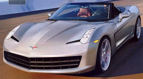
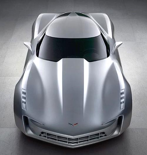
The Silver C7 Corvette Concept Car
Since this car doesn’t appear to have a dedicated name, besides C7 Corvette,
I’ll refer to this as “the silver car.”
Here’s what I like about the Silver car…
- The proportion is consistent with the Corvette look.
- The fender bulges from the C6/C2 are still part of the design
- The roof looks lower and more like a real fastback.
What I don’t like…
- The entire front looks like a cartoon character with a BIG mouth.
- The vertical headlights look tacky. It’s a “look” applied for no other reason than it’s “a look.”
- The black slits, inboard of the lights look like a bad ethnic joke
- The side rocker panel looks like something from a body kit.
- The arches over the front and back wheel wells make it look thick. Either a thin edge or no edge.
- Rear fascia is WAY too busy. It looks like something from a Nissan.
- The side marker lights appear to be just stuck “there” for no real reason.
- The trapezoid door handles look contrived.
Recommendations:
- Just try again. And stop looking at the cars from those other sports car makers. Remember the classic design adage, “Form follows function.” While I admire and respect Harley Earl’s designs, he was from the school of design that is dedicated to the idea that every surface of a car should have lots of little elements of discovery. Nice notion, but it often lead to over decorated cars. Bill Mitchell changed all that, that’s why the Sting Ray and Mako Shark designs are such classics. And no, these were NOT big cars, their proportions made them look large.
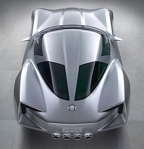
The Transformers Movie / C7 / Concept Corvette
Here’s what I like…
- Basically, I like the side-view profile of this car. It looks long and sleek.
- The angle of the front fender vents matches the angles of the A and B-pillars.
- I like the WIDE stance of the car. A platform like that with a low center of gravity will handle great!
- The very wide tires fill the wheel wells – maybe a little too tight for a production car. Wheels and tires do have to go up and down in real cars.
- The large rear tires fill the rear fender humps perfectly.
- The hood bulge is just the right size.
- Swept-back side mirrors look organic.
Here’s what I don’t like…
- The right and left front grille openings looks like a freakish grin of a cartoon character with black teeth.
- I don’t like the narrow flat plane on the top of the fender humps.
- The headlights on the leading edge of the front fender humps – WAY too common.
- About the roof. I “get” the homage to the ‘63 Split-Window Coupe, but this ain’t making it. The split-window went away for a good reason, let’s not go back there.
- About the rear fascia. I “get” that the design mirrors the front, but it looks like a different cartoon character. Hopefully, this cartoon business was just for the movie car. PLEASE.
- I’m not wild about the indentation in the center of the roof, matching the hood dome and gently pointing back to the center of the top of the rear fascia.
Recommendations:
- I’ve been looking at this car for several years and I just can’t shake off my very first impression; “OH, MY GOD! The kids at Hot Wheels designed this car!” I’m sure the toy version will do just fine. My highest hope for this car is that they fix the front and rear of the car.
- The hood is good, just add a slight crease in the center that will continue over the roof, the split window and to almost the back edge of the fascia.
- Lose the indentation on the roof.
- If they want to do the C2 Sting Ray roof, make it proportional to the original by giving it a little “kick up” at the back part of the glass and make the split proportionally slim to the ‘63 split.
- Lose the headlights on the edge of the front fender humps. The exposed headlights of the C6 are a very slick design. There’s plenty of room on the front top surface to create an integrated headlight cluster. No pop-up headlights, please.
- When I look at this car, I see too much Cadillac. Nothing “wrong” with Cadillac, they’re fantastic cars. I’m very impressed with what GM has done with the line. They are performance luxury GT cars – DEFINITELY not my Dad’s Caddy! Leave the “Caddy-look” to the Caddys.
What Would Bill Mitchell Say?
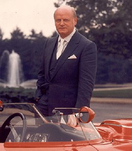
The Corvette arguably has the richest styling history in all of automobile design. I don’t know that it’s possible to deliberately design a “classic.” In the ‘50s, Mitchell was inspired by a few design elements he saw on several European cars – the Sting Ray’s fender humps, specifically. Mitchell, along with styling help from Bob Veryzer and Pete Brock, came up with the stunning ‘57 Q-Corvette that was the starting point for the Stingray racer that became the C2 1963 – 1967 Sting Ray. Larry Shinoda was just a start-up designer that helped translate the Q-Corvette into the Stingray racer. No sooner had the new ‘63 Sting Ray hit the showrooms, Mitchell came up with the concept for the Mako Shark II. Shinoda and his team of stylists worked out Mitchell’s vision and when it arrived, it was like nothing anyone had ever seen. The Mako Shark II HAD TO BE the next Corvette!
These designs were so powerful, they completely set the tome and shape of the Corvette forever. Like it or not, after all these decades, that’s what we have. During that time, there have been many Corvette concept cars that may have made for a lovely Pontiac or Buick, they just weren’t a “Corvette.” Also, over the decades, many a coach-builder from overseas has built their vision of a Corvette. And while they might be interesting and would make a lovely Acura, they weren’t a Corvette.
A few years after Bill Mitchell retired as GM’s chief of styling, he gave several long and interesting interviews. He was pretty pessimistic over what he was seeing from GM in the ‘80s and there was a good reason for that. Mitchell could be a real bull. He was a tough corporate guy, a force to be dealt with. When he was pushed out at the mandatory age of retirement, 65, GM’s management made a command decision.
According to former Corvette chief of engineering, Dave McLellan, in his book, “Corvette From The Inside,” Mitchell’s replacement was Irv Rybicki, a “team player, someone that would allow GM’s top brass more control over styling. Mitchell had been a real pain in the ass, and the board wasn’t going to have any more of that! Rybicki liked big, cushy cars, and had a debilitating back problem. Consequently, he didn’t like Corvettes. Irv may well have been an okay guy, but he was definitely a yes-man.
Mitchell often expressed the philosophy that designers can’t work by committee. He said, “Do you think that Frank Lloyd Wright went around knocking on doors asking, “So, how do you think I should design a house?” No! He designed houses and let everyone “get it.” Same with Bill Mitchell. He didn’t design the Stingray racer by committee. He didn’t design the Mako Shark II through a focus group. No! He designed it and we all had to pick up our jaws – it was THAT GOOD.
The Final Verdict
The Silver Concept Corvette is just a mediocre face lift. “Different,” but why bother?
The Transformers/Centennial/ Corvette Concept car is way too cartoonish. The hour or two that it has taken me to study and write this critique has inspired me to do some pencil overlay drawings to fix the mess on the front and back of this car.
The book, “COR-VETTE Specs 1984-1996” by Mike Antonick has a collection of photos of preliminary C4 styling concepts from pages 19 to 30 that show how ideas are flushed out. Some are interesting, most were just a process to get to the final design.
And then again, this could all be just an effort to keep the Corvette bunnies stoked. GM is still not in a good position. Sales have been up lately, but up from where, the absolute bottom? Every year there will always be a certain number of people that will buy a new car. However, as the economy drags on, with no real new jobs, how will there be a genuine recovery? You know, JOBS for those that have lost theirs. And not low-paying jobs either. If one is suddenly “employed” but at 60% of their previous income level, they will most likely not be looking for a new, expensive car, let alone a Corvette.
Until this changes, we’re going to have a lot of rough sailing ahead.
So, we shall see. But for now, we’d like to know your thoughts and feeling about the styling direction of the two concept Corvettes presented here.
In another article coming soon, I’ll be looking at where the Corvette could go, if I was the “King of GM.” Let us know what’s on your mind concerning the styling of the cars presented here. The “Leave a Comment” box is just below. And if you would like to add what you would do if you were the “King of GM”, feel free! – Scott
PS – Check out the illustrations I created for my VETTE Magazine column based on the above post, that ran in the October 2010 issue as a center spread, HERE.
PSS – Here’s the link for that VERY interesting interview with Bill Mitchell…
http://www.autolife.umd.umich.edu/Design/Mitchell/mitchellinterview.htm
(Car Photos courtesy of Road and Track)
Here is another C7 Concept car article of mine that you might also enjoy.



I like the SILVER, edition.
Stands out of the group as nothing else does and you can still see CORVETTE!
I agree with much of your critique. The C6 corvette is the best looking generation so far (in my opinion), and the organic creasing style really flows well. I couldn’t stand the front and back of the transformers car, and I don’t like the front of the silver (the back is semi decent, but needs less detail). What ford did with the 2010 mustang rear end was a good move. If GM can pull off something like that with the corvette for the next generation, they’ll keep the corvette well alive.
I like the potential new design and C7 will most likely be a cleaned up version of the silver Corvette. The designers have a tradition to uphold and they havent let us down yet.
1st: I like the 4 exhausts on Transformer, but utilize a similar sweet ass end – like on the C6, & have easier access into the 22 cf trunk, plus incorporate a real spoiler. 2nd: Transformer side view is excellent (between the wheels), but side visability looks compromised! Also, make the C7 easier to access – maybe use the Gull wing doors? 3rd: both front end concepts suck… way too much grill on Silver & WTF “C” openings on Transformer: instead add a sleek (stealth looking), larger & functional hood scoop for added performance. 4th: Improve interior with higher grade materials – for Obvious reasons!
Hi David,
Thanks for your thoughtful comments. I had to look at the Transformers car for about a half hour to see past the silly-looking front and rear end. In a sense, it reminds me of the 1960 XP-700 Corvette Dream Car (just go Google Image the words “XP-700 Corvette”), in that while that in retrospect the XP-700 sort’a-kind’a looks like the ’61-’62 Corvette, the front end was wildly over done and the bubble top concept never caught on for obvious reasons. So, lets hope that the Transformers car is in a similar situation. Just this week I completed a set of drawing for my Illustrated Corvette Series No. 160 installment, of my version of the “fixed” Transformer that I’m calling “the C7 Split-Window Coupe Sting Ray.” That should give you a hint as to where I took the shape. I REALLY wish I could post the drawing now, but my agreement with VETTE is that they get “first use” rights on art, photography, and story copy. Sooo… I’ll have to wait till early July when the September ’10 issue of VETTE comes out. TRUST ME, I will post the illustrations right after the magazine arrives in my mailbox! They came out REALLY cool. Thanks! – Scott
Hi Christopher. I think that last year’s dismal sales performance had NOTHING to do with the car and everything to do with the STINKO economy. The C6 had been selling very well with oodles of very good reviews (we’ll ignore the “interior” issue that really isn’t THAT bad). So, because they have a bad sales year, now there’s something wrong with the C6 design??? No, if we were living in a robust economy, ’09 would have been another good year for the C6. I see MUCH more that can be done with the C6. Perhaps that’ll be my next blog! Thanks!
Hi,
The Silver Stingray concept looks great, just clean the back up alittle more. it would make a great C7 edition. It’s time to push the Corvette up against the Ferrari.The Corvette lines are always fluid looking. The car looks like it is in motion when it is sitting still. I own a C6 2007 Lemans Blue vette. When it is parked some where people stop and stair. That’s what the C7 design should do to the average person. Make them want to own a Corvette. Thanks for your time.
As for including international design in a Corvette, remember, Bill MItchell was inspired by the shapely fenders of European sports and racing cars. This led him to the perfect-for-its day C2, the high point of Corvette styling.
The C3 Mako Shark was cartoonish. I was a kid then, and I liked it; as an adult, I do not.
The C4 had the lines of an extruded, plastic Camaro, and it was boring.
The C5 and C6 combine unsophisticated imitation of Ferraris with too many traditional Corvette styling cues. Also, the insistence on a marginally useful, removable roof panel has continued to yield an ungraceful interruption in the roof and a rudimentary-looking b-pillar that does not blend with the overall design of the car. The windshield surround also does not blend with the body, as it continues to be designed as a black element separated, by a huge gap, from the lines of the roof and fenders. And did I forget to mention the enormous ass of the car? Anything that will break that up will be welcome. Also, don’t forget to chop off the heavy overhang in front that likes to scrape on everything in sight.
There a thousands of American men like me, in Corvette’s largest demographic, who have painfully been hoping for years that this car will someday be rid of its clunky looks. We know it is a top world sports car, and we want it. We just can’t stand to be seen in one.
Note to GM: Listen less to Corvette traditionalists and more to the far-larger number of people who keep hoping the way I have. You will multiply your sales here is America, and also add some international sales.
Thanks for your interesting comments Charles. Here are a few thoughts on your comments.
When looking at styling and design, we should always look at the cars of the period in question. Yes, Mitchell was looking at European cars, but no one could say that the C2 looks anything at all like what was coming out of the European sports cars makers of the late ’50s and early ’60s. As to the Mako Shark II, it certainly was an original. “Over the top,” YES. “Cartoonish,” well, I guess that’s subjective.
I have often wondered what the C2 Sting Ray could have evolved into had the Mako Shark II not come along. Today’s 911 Porsche still has the look and proportion of the first 911. So what would a modern day C2 Sting Ray look like? Stay tuned to October issue of VETTE (due out early August) that will feature a special 2-page Illustrated Corvette Series that features my remake of the Transformers/Centennial Corvette concept car.
Call me a traditionalist, but if GM wants to make the Corvette a “world” car and completely abandon all connections to its past, style it like a Nissan bar of soap,then call it some meaningless letter/number (FZ475), but DON’T call it a Corvette. And if Americans don’t want to be seen in a clunky Corvette, there are tons of “I look like 6 other cars” cars out there that cost less and much more than a Corvette.
As far as international sales are concerned, I don’t believe Europeans will but any high end sports car coming from America.
Until, the C4, no other car, looked like a vette.
Along comes the C4. Double take for a camero or Firebird.
I’ve had 2 C3s and now a C4. Still like the C3s.
I know I can’t wait to finally see the new Corvette. There is a lot of speculation amongst the members at Smokinvette about what the final new appearance will be. Any way you cut it there is a lot of anticipation for it to show itself.
Hi Greg,
Thanks for your comments! Anticipation of a “new” Corvette is always fun. I’ve never been disappointed, although expectations may be unrealistically high this time around.
The October issue of VETTE Magazine will be out around the third week in July. (I know, I know, the “October” issue in July???) Illustrated Corvette Series No. 160 will be a special 2-page spread featuring my version of the Transformers/Centennial Corvette concept car.
By agreement with VETTE, I’m precluded from showing any of my illustrations before they are published in the magazine. The publisher has “first use rights,” including electronic mediums, so I can’t do a “sneak peak” here. But, I can give you a hint.
Most of my comments from the above blog article were integrated into my illustrations. The usual Illustrated Corvette Series column features three illustrations; a small side-view, and a front and rear 3/4-view. The special 2-page installment will feature 5 illustrations; a large side view, front and rear 3/4 views, and straight front/top and back/top views.
Also, while on the topic of the C7, there’s been speculation chatter that the C7 might be an interim car that’s essentially a mechanically/electronically enhanced version of the current C6 with the same basic body shape, but with more extreme styling. I have some ideas of what that might be that could possibly be an Illustrated Corvette Series column installment, maybe in the January or February 2011 issue of VETTE.
And, speaking of VETTE Magazine, I should mention that Corvette Fever magazine is being melted into VETTE Magazine. The merger will show up as a totally revamped VETTE Magazine with more pages, a totally new layout, and a slightly bigger format – possibly the size of “Corvette Magazine,” and hopefully with a nicer binding.
The “new” VETTE Magazine will arrive as the November issue, due out around the third week of August – just in time for the Corvettes At Carlisle Show! Also, the “new” issue of VETTE will also feature Part 1 of a 2-part, color special, highlighting the Special Edition Corvettes. Nuff said, for now. – Scott
As long as it remains a ‘Vette and does not look like some EuroJapo clone I’ll be happy. The new Corvette has to be visually different from the rest. It also absolutely has to be functional and dramatic.
On the tech side the car definately has to lose more weight (lots more). The entire car should be physically much more compact than at present*. Keep the V-8 though. That’s a vital, tactile part of the experience.
Corvette needs to be the best real sportscar money can buy. If you guys can give me a driving experience as intense and as fun as my Yamaha R-1, well THAT would mean you have arrived at the pinnacle- the Best in the World. Otherwise…… the possibility of old-man couldabenacontenda status beckons.
—
* Why it has to be a lot smaller.
Test day at a race track in Australia… A Nissan Skyline GTR race car (a.k.a. Godzilla) which had been raced at Bathhurst (they won there more than once) was on slicks and was first car out. To say it lapped spectacularly fast was an understatement. Then the latest road going version of the GTR was tried. Not as fast, but still very impressive. Finally, for fun, a prosaic Nissan Pulsar hatch was run. It’s lap was slowest of the three- no surprise that. It was when a tight slalom course was set up that matters changed. The race car was still fastest (but only after a heroic, pull ALL the stops out Kamakaze run by the owner who at all costs wanted to avoid the “shame” of being beat by an economy “runt mobile”). The Pulsar beat the road car, but only just. Still, it was competative. IT SHOULDN”T HAVE BEEN. Finally, we drove home and as it happened we went along a narrow twisting road. That tiny annoying little economy hatch thing was impossible to shake off until the highway. And then there were cops and radar and speed traps…
I drove the Pulsar later and found it to be a modest bit of fun. With better suspension and some basic engine work it would have killed those two super cars…
In the real world you need something that goes like a shifter kart, even when the road gets narrow, bendy and tight. Then you can pick better lines through corners and have much more road to work with. That means your sportscar should be as compact as possible. Small cars are responsive and enjoyable. Tighter corners and narrow lanes do not muck them up, as they do a larger car. So make the Corvette small and take right over as the one to beat EVERYWHERE. Have the best of everything- small, powerful, good handling, best roadholding, perfect styling, tactile, responsive- have it all.
Sione